HISTOGRAM
WHAT IS A HISTOGRAM?
A frequency distribution shows how often each different value in a set of data occurs. A histogram is the most commonly used graph to show frequency distributions. It looks very much like a bar chart, but there are important differences between them. This helpful data collection and analysis tool is considered one of the seven basic quality tools.
Histograms vs. Bar Charts
Both histograms and bar charts provide a visual display using columns, and people often use the terms interchangeably. More technically, a histogram represents the frequency distribution of variables in a data set. On the other hand, a bar graph typically represents a graphical comparison of discrete or categorical variables.
WHEN TO USE A HISTOGRAM
Use a histogram when:
- The data are numerical
- You want to see the shape of the data’s distribution, especially when determining whether the output of a process is distributed approximately normally
- Analyzing whether a process can meet the customer’s requirements
- Analyzing what the output from a supplier’s process looks like
- Seeing whether a process change has occurred from one time period to another
- Determining whether the outputs of two or more processes are different
- You wish to communicate the distribution of data quickly and easily to others
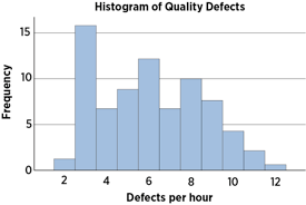
Histogram Example
HOW TO CREATE A HISTOGRAM
- Collect at least 50 consecutive data points from a process.
- Use a histogram worksheet to set up the histogram. It will help you determine the number of bars, the range of numbers that go into each bar, and the labels for the bar edges. After calculating W in Step 2 of the worksheet, use your judgment to adjust it to a convenient number. For example, you might decide to round 0.9 to an even 1.0. The value for W must not have more decimal places than the numbers you will be graphing.
- Draw x- and y-axes on graph paper. Mark and label the y-axis for counting data values. Mark and label the x-axis with the L values from the worksheet. The spaces between these numbers will be the bars of the histogram. Do not allow for spaces between bars.
- For each data point, mark off one count above the appropriate bar with an X or by shading that portion of the bar.


Comments
Post a Comment